Many years ago I managed to get my own handwriting immortalised as a Windows font, which I could use in any Windows application. It even printed properly too, from any program. The whole process was done by post and took about a week. It cost something like $50 at the time, if I recall.
Which is just one of the reasons why I'm so hugely impressed by a new web-based service that will do the job instantly, and for free.
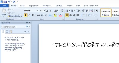
Head to www.paintfont.com and decide which characters you'd like included in your new font. You'll probably want the standard A-Z, a-z, the digits, and probably a selection of punctuation and accented characters too. Once you've chosen, you can download a template which contains the necessary squares into which you then write. It's best to use a black pen, and to take your time so that you get the best results.
When you're done, scan the template paper and upload it to the www.paintfont.com site. Within just a minute or so, your TrueType font file will be ready to download. Grab it, install it (which is usually just a case of right-clicking it and choosing Install), and your font is now ready to use in all your Windows apps.
If you have children, you could even use the service to preserve their handwriting in order to see how it develops over time.
 We are looking for people with skills or interest in the following areas:

Comments
Okay - might want to take it off the site - the 75 characters you are allowed is too few to create a font with upper and lower case letters, numbers and basic punctuation, which comes to 80 characters.
So, basically, it's not free any more. It was fun while it lasted.
PaintFont.com is now https://www.calligraphr.com/ - with extra features and (supposedly) an easier UI.
============
An update. I have created an account (which the new page requires), and, while you can create fonts for free, there are limits on the free version nowadays:
1 font
75 characters (no ligatures) per font.
3 variants per characters .
There is a paid version without such limits, which is available by the month (no subscription, pay for just the month)
how to make my font
;p
A very simple process. Outcome was junk.
Okay, folk, finally finished a full font worth.
Due to the fact that i used a paint program to size the characters accurately to paste them into the PNG of the template, some of them vary a bit in stroke weight. Otherwise, came out pretty good: http://electronictiger.net/fullfont.jpg
I should have used quadrille paper or something with guidelines, rather than a blank sheet when i printed the initial characters.
Hi electronictiger,
That link of you led me to one of the most funny, creative and yet informative 404 pages I've ever seen.
It put a big smile on my face.
I fixed the link. Arrrgh.
Yup, I tried a different browser and got it going. I forgot to come back and say that. Must have been one of those wonderful computer enhancements seemingly built into every program - - - I call them "Glitches."
For me, this site is more good idea than definitely doable, and for the reason that some have mentioned - if you don't have a steady hand and eye, getting each character to line up, look connected to adjoining letters, and be smoothly drawn is downright difficult. My results were also on the horrendous / unusable side of the results scale.
@Fairportfan: It may be simple, at least in theory, but easy to accomplish / get good results, its nowhere near being simple.
Okay. I tried it. Just a quick'n'dirty; i only generated the numbers 0 to 9 and the letters to write a short sentence.
I tried it twice - once using a black ballpoint and one using a fine-point Sharpie. I wasn't particularly careful about my penmanship, either.
Not counting the trip to the store to buy a marker and pen (thirty minutes), and arguing with my DTP software as to whether they were fonts it wanted to admit existed (other programs had no problems; i guess Serif PagePlus is snooty), total time involved in making this limited character set was about twenty minutes, counting making the scans.
You can see the result at http://electronictiger.net/fonts.png
(When i was actually making the fonts, i noticed that they offer the templates as PNG images; as i said before, if you download those, you can copy/paste individual images into the blocks if you are having trouble writing in them on the template itself.)
Remember to print the templates in colour - actually, i don't know if it will make a difference, but the faint images in each block are red to make them less likely to reproduce.
Do NOT scan in B&W mode - greyscale is preferable, but they say you can get away with colour.
I scanned at 300 DPI.
Hope this helps.
(I'm working on a very large set, with numerous special characters; when i finish it, i'll post the results online and link 'em here.)
I checked it out and love it. Everyone can tell you're a sports nut because your handwriting is doing the wave!
I'm going to try it and hope mine turns out that unique.
I was thinking about using it for emails or applications for government forms BUT; if the receiver doesn't have that font on their computer, it gets replaced by Calabini or Times Roman or ...
BUT THEN AGAIN... could save it as an html document in Word and send it in email.
I've uploaded a sample of my handwriting font, created with a very similar program (quite possibly the same software they're using) a year ago, to my webhosting at http://electronictiger.net/handrot.jpg
===========
Don't try to produce true cursive with connected letters.
If you have problems getting the letters to line up on the grid, write all the characters separately on paper, scan it, and then copy/paste appropriately-resized images of each one into the image of the template.
(I did that once to produce a "ransom note" font using letters cut from newspapers and magazines.)
You probably worked harder when you used the software before. The result is really nice. I struggled with a font editing software years ago too but the results weren't really worth the trouble.
I'm glad this service is up so I can give it another go. I had different reasons to want my personal font back then, but now it would be great to use on my personal blog as a custom web font. Thank you Rob for sharing it with us!
I tried it but the results were horrendous. It didn't recognize over half of my input. Unusable.
What did you use to fill in the template?
Black is pretty much mandatory, a fine-point or extra-fine-point Sharpie is best of all.
I used a black, fine point, BiC Mark-it pen. The 5 or so letters that did come out well were beautiful and well formed. But the rest of the letters that did not (they showed up as blank rectangles) made me quit my efforts.
I can't understand why only some letters appeared and not others, when this is a *hand* writing font, and theoretically anything that's in the box, regardless of shape, should show up.
Try again with a Sharpie.
Sorry - It doesn't work. The web-site locks up at the first step!
What browser?
Worked fine for me in Opera, and in Firefox and (though i use it only reluctantly, and generally only to check websites) in IE.
=============
Try clicking the "Create Template" button. If that works, it's not locked up, just strangely designed.
While you're at the first page, try typing characters that aren't already shown in the block, and they should go into the list to be on the template, even there's no cursor there.
I'll give this a go today!
I tried one during it's beta & it may have been the one you were speaking of: fontifier? I think?
Can you tell me if the letters need to be centred in each square for even the symbols? I recall that when I did the one from before, the quotes mark was too low & comma too high-- if you know what I mean? Can you elaborate?
Cheers!
A further look reveals that the lightly-printed guide characters on the template show where you need to place the character in the block.
If it's like other font-generation programs, position them as if the test baseline ran across the block about a third of the way up - lower-case letters ought sit on that line and go up to about one-third down from the top, which leaves room for ascenders and descenders; comma and period should sit at the point where the baseline would be, quote and apostrophe should be about one-third from the top of the box.
I'll go download a template and come back and amplify this a bit.
===========
Okay; i looked at the templates, and they have tick marks for baseline, ascender and descender height and so on.
Looks simple.